Many times game localizations include graphical changes, and that holds true for The Legend of Zelda too. A handful of graphical changes were introduced during the localization process – here’s a quick peek!
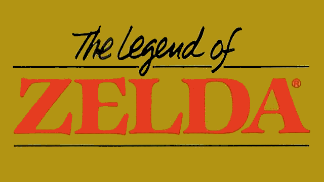
Title Screen

As you might expect, the title screen is slightly different in both versions of the game.
The Famicom Disk System version says, “The Hyrule Fantasy – Zelda no Densetsu”, and below it is “Switch to Side B”.
The NES version says, “The Legend of Zelda”, and below it is, “Push Start Button”.
 |
So what happened to the thing about “The Hyrule Fantasy”? It was dropped completely from all the localization stuff, but in Japan it was included on everything that used this logo, from the game’s box to all related merchandise, like this board game:
 |
In a way you might even think of it as the game’s subtitle, like “Adventure of Link” or “Ocarina of Time”. In North America, though, it’s just plain ol’ “The Legend of Zelda”.
Okay, so then what’s the Side B dealy about? Well, the disks used by the Famicom Disk System are two-sided, and occasionally you would have to flip the disk over to continue. Not all FDS games were two-sided, but Zelda was.
 |
Incidentally, the Famicom cartridge version of Zelda released in 1994 had its title and title screen changed to include a “1” in the name:
 |
This didn’t happen with any of the English-language reprints or ports, though.
A Difference of Font
Another thing that’s immediately obvious is that the English font is different in both versions of the game. The FDS version is a thin 8×8 font, while the NES version is the standard, thick 8×8 font used by lots of games back then.
Japanese players actually got the thick font years later when the cartridge version of the game was released in 1994. I guess that counts as a rare case of a double reverse localization change 😛
 |
Zora Makeover
Another easily-spotted graphical difference is the Zora.
In the FDS version, the Zora graphics are like all the other enemy graphics – no outlines at all.
For the NES version, they added in outlines and better contrast to the Zora graphics. This makes them a lot easier to see in the blue water. This change was kept for lots of later ports too.
Here’s a look at the Zora face in both versions:
 |
And here’s a look at the Zora when it’s facing away from the screen:
 |
I knew the Zora had two different sprites in the NES game, but I never knew what the non-face one was – it just looked like some weird thing. I guess I never realized until now that it was supposed to be a Zora facing away from the player. It was immediately obvious to me when I saw the FDS version, though. Neat!