In my books and articles, I often mention how the Japanese language uses a blend of three main writing systems. I still remember how weird that sounded before I started studying Japanese, so I thought I’d write a brief overview for readers who aren’t familiar with the language.
Most of this is stuff they teach you in the first day of Japanese class, so if you’re familiar with the language, you probably already know all of this. But if you’re completely new to the language, this is good, fundamental stuff to know as you read through this site.
System #1: Hiragana
Hiragana is kind of like our alphabet, except almost every character represents a full syllable rather than a single sound. Because of this, hiragana is referred to as a “syllabary”. The Japanese language is built from these base syllables, so every word in the Japanese language can be written using hiragana alone. Hiragana is primarily used for Japanese words and Japanese grammar.
In general, hiragana characters are simple in shape, are curvy-looking, and only take a few quick strokes to write. As an example, here’s the Japanese word neko (“cat”) written in hiragana:

There are 46 basic hiragana characters, and they’re simple enough that you could learn them all in a few days. If you’re interested, my Passport to MOTHER 2 and my Passport to UNDERTALE both cover the full hiragana set, how to pronounce the characters, how to use them, what pitfalls to look out for, and so on.
System #2: Katakana
Katakana works pretty much the same way as hiragana, except it’s just a different set of characters. Katakana is primarily used for foreign words, but it’s also used for emphasis, drawing distinctions, aesthetics, and other purposes. Every word in the Japanese language can be written in katakana alone.
Katakana characters are also pretty simple-looking, but are generally more angular and blocky than hiragana. As an example, here’s the Japanese word neko (“cat”) again, but written in katakana this time:

Just like with hiragana, there are 46 basic characters to learn, and they’re all simple enough that you could learn them in a short amount of time. Again, if you’re interested in learning more, both of my Passport to MOTHER 2 and my Passport to UNDERTALE cover the full katakana set, pronunciations, pitfalls, usage, and more.
System #3: Kanji
Japan adopted the Chinese writing system over 1000 years ago, and today that system is known as kanji. Kanji characters represent ideas rather than pronunciations. In fact, kanji characters can sometimes have a dozen or more possible pronunciations each.
Because there are thousands of kanji characters, it’s harder to describe how to identify them. But in general, if you see a Japanese character that looks complicated to write, feels “Chinese” somehow, or looks like it could be someone’s ill-planned tattoo, it’s probably kanji. Again, here’s the Japanese word neko (“cat”), but written in kanji:

Of course, it takes time to learn all the kanji characters and all their readings, so stuff aimed at a younger audience will usually only use basic kanji characters. And, just to be extra sure, writers will often include pronunciation guides above kanji characters, like this:

Japanese adults are expected to know approximately 2000 kanji by the time they leave school, but there are thousands more kanji characters beyond those. Kanji is undoubtedly a huge hurdle for Japanese language students, and educators have come up with countless approaches to making kanji less intimidating. Even I have my own unique kanji-learning system that I hope to share someday.
An easy way to remember the difference between the three systems is this: hiragana starts with “h”, which is kind of curvy. Katakana starts with “k”, which is angular. And kanji has thousands of characters that take a long time to learn, so imagine thousands of “can”s of food that take a long time to open by hand.
Mixing It Up
A common question I hear is “what’s the point of having three writing systems?”.
The best answers I have are more questions: why does English need uppercase and lowercase letters? Why does it need block writing and cursive writing? Why do we need to have both “ɑ” and “a”? Why does “train” so often sound like “chrain”, and why does “number” have more than one pronunciation? If you think about it, we have lots of similar writing system craziness too.
Anyway, normal Japanese writing uses a nice mix of its three writing systems. There are even professional guidelines that prescribe how much hiragana, katakana, and kanji any given sentence should ideally have.
The three Japanese systems work together to make text easier to read and parse, a lot like how English becomes easier to read when you have uppercase letters, lowercase letters, and spaces. After all, ITDSUCKIFYOUHADTOREADTHREEHUNDREDPAGEBOOKSWRITTENLIKETHISINENGLISHANDIFWEALLHADTOWRITEEVERYTHINGINENGLISHTHISWAY.
Other Systems
If you wanted to get really technical, modern Japanese uses more than just its own three writing systems. The English alphabet now plays a major part in the language, as do Arabic numerals. Japanese also has a category of shorthand characters like 〆 and 〼 that show up on occasion.
In Japanese Video Games
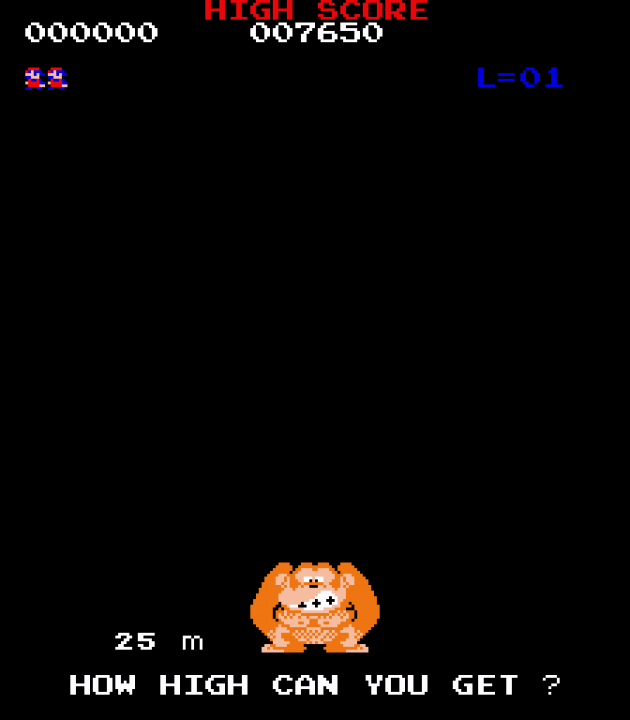
You know how old English video games used to only use capital letters? And how they usually only had one font they used for everything in the game?
A lot of the time, old games were in all-caps because it was technologically easier or cheaper to support just the 26 uppercase letters rather than include all 52 uppercase and lowercase letters.
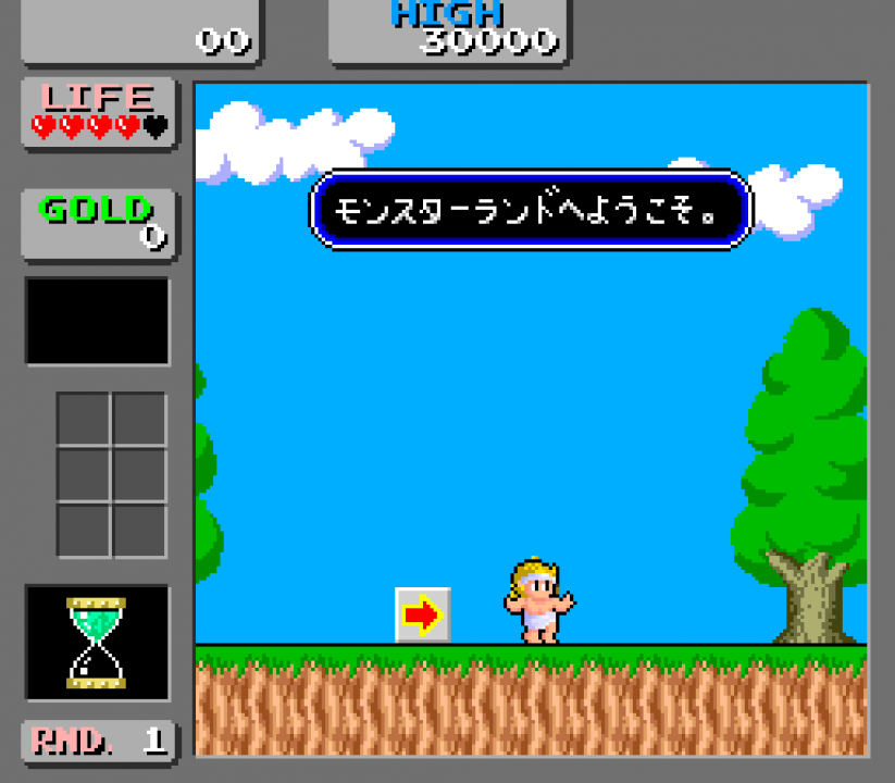
The same sort of thing happened with old Japanese games too. Except, as we’ve seen, Japanese has three writing systems and thousands of different characters total. Japanese developers handled this problem in different ways over the years, until it became easy and feasible to support large Japanese character sets.
Writing Everything Out in English
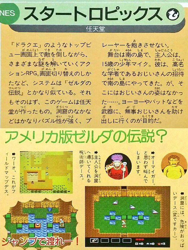
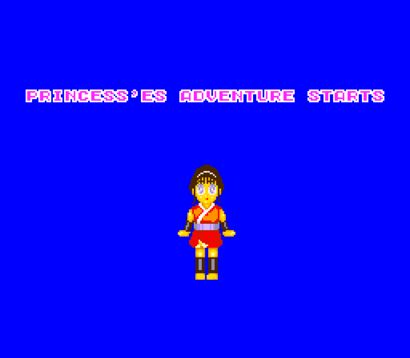
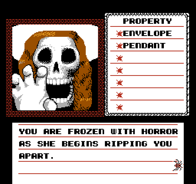
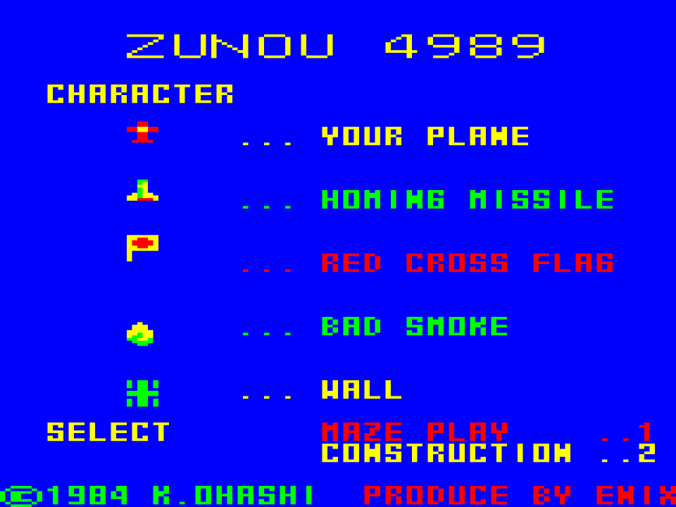
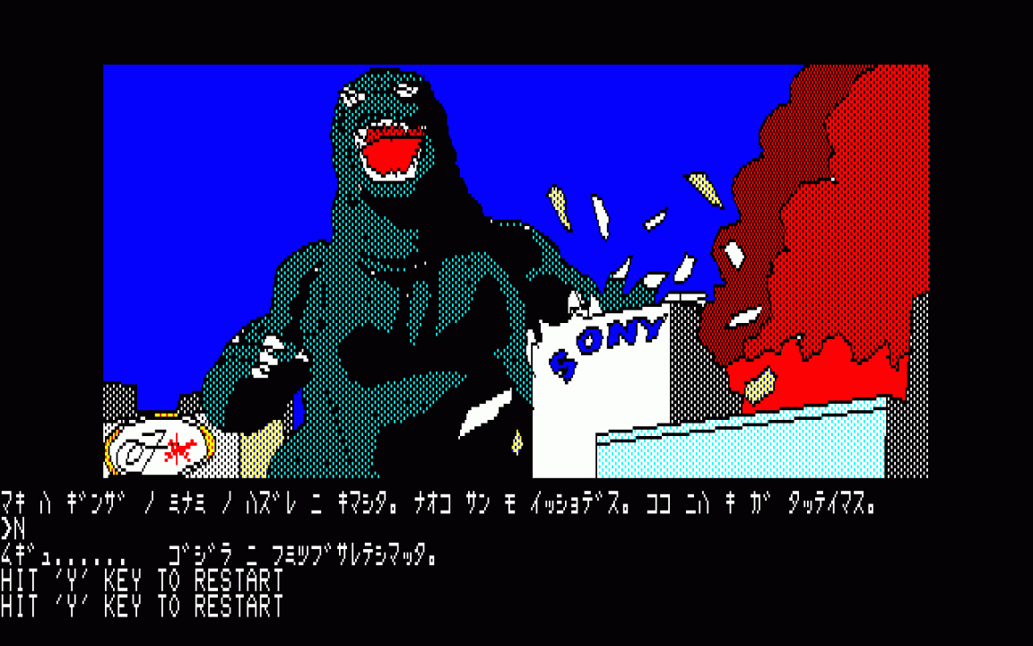
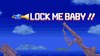
Some developers avoided using any Japanese characters at all and simply stuck with the 26-letter English alphabet. Sometimes the text would remain Japanese but be spelled out phonetically, and sometimes they’d literally just write everything in English and hope that players could understand it.
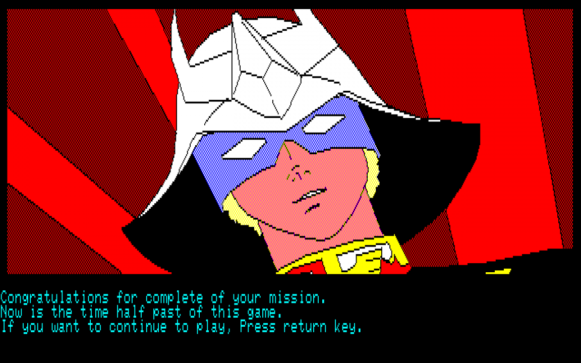
See more of this great English writing here
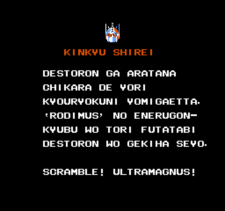
More info on these mysterious ending messages here
Japanese games have been using English in this way since the very beginning, so English is an essential part of the Japanese gaming experience. This is one reason why translating every English word into Japanese isn’t a good idea.
Writing Everything in Hiragana
As previously mentioned, hiragana has only around 50 characters and can be used to write every word in the Japanese language. So that’s what some developers did: they wrote everything in hiragana. It wasn’t ideal, but it was good enough.
Writing Everything in Katakana
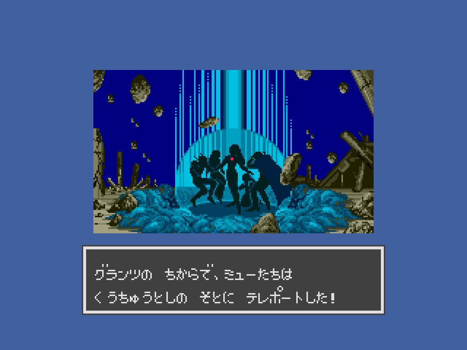
Katakana, like hiragana, only has about 50 characters and can be used to write every word in the Japanese language. Many early developers chose to write everything in katakana. In fact, it seems katakana-only games far outnumbered hiragana-only games.
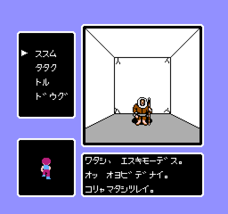
I wrote about this game - and this scene in particular - in this article
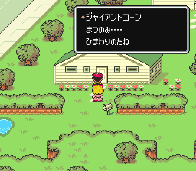
Using Only Hiragana and Katakana
As hardware and software improved, more and more developers were able to use two of Japan’s writing systems instead of just one. Combined, hiragana and katakana only required a game’s font to include a hundred characters or so.
Using Hiragana, Katakana, and Limited Kanji
For a long time, the third writing system, kanji, was still too much of a hassle for industry-wide support. This is understandable: there are literally thousands of kanji, and many of the complicated kanji characters become messy, hard-to-read blobs at small sizes:
As things progressed, developers began including all three Japanese writing systems, but using only a select portion of the full kanji set. This wasn’t a serious problem, though, as younger target audiences wouldn’t necessarily know all 2000 standard kanji anyway. This addition of kanji brought game text to a whole new, modern level.
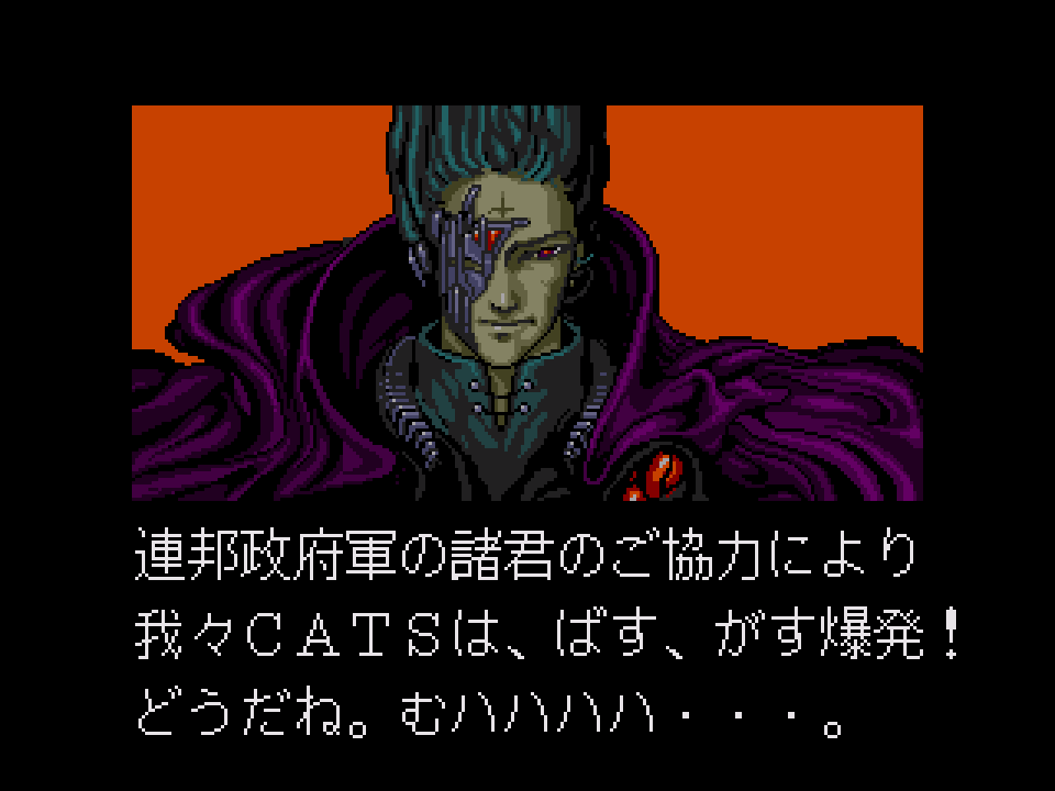
Incidentally, I wrote about all these 30+ secret Japan-only endings here
Game Text Today
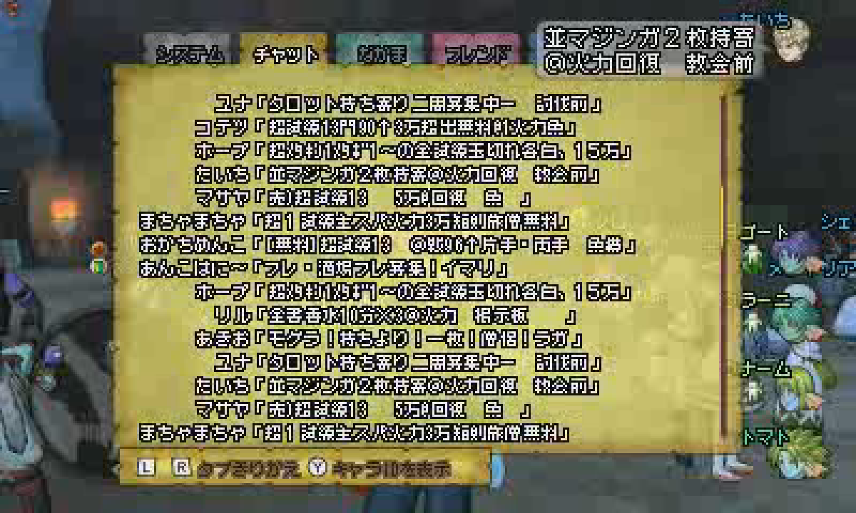
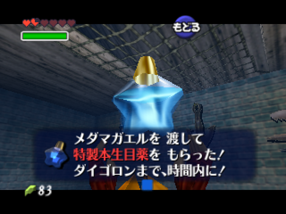
Game developers today are no longer limited to portions of the full Japanese character set. And thanks to high-resolution graphics, it’s easier than ever to include complicated kanji characters without losing readability. It’s now even possible to include the tiny pronunciation guides above kanji!
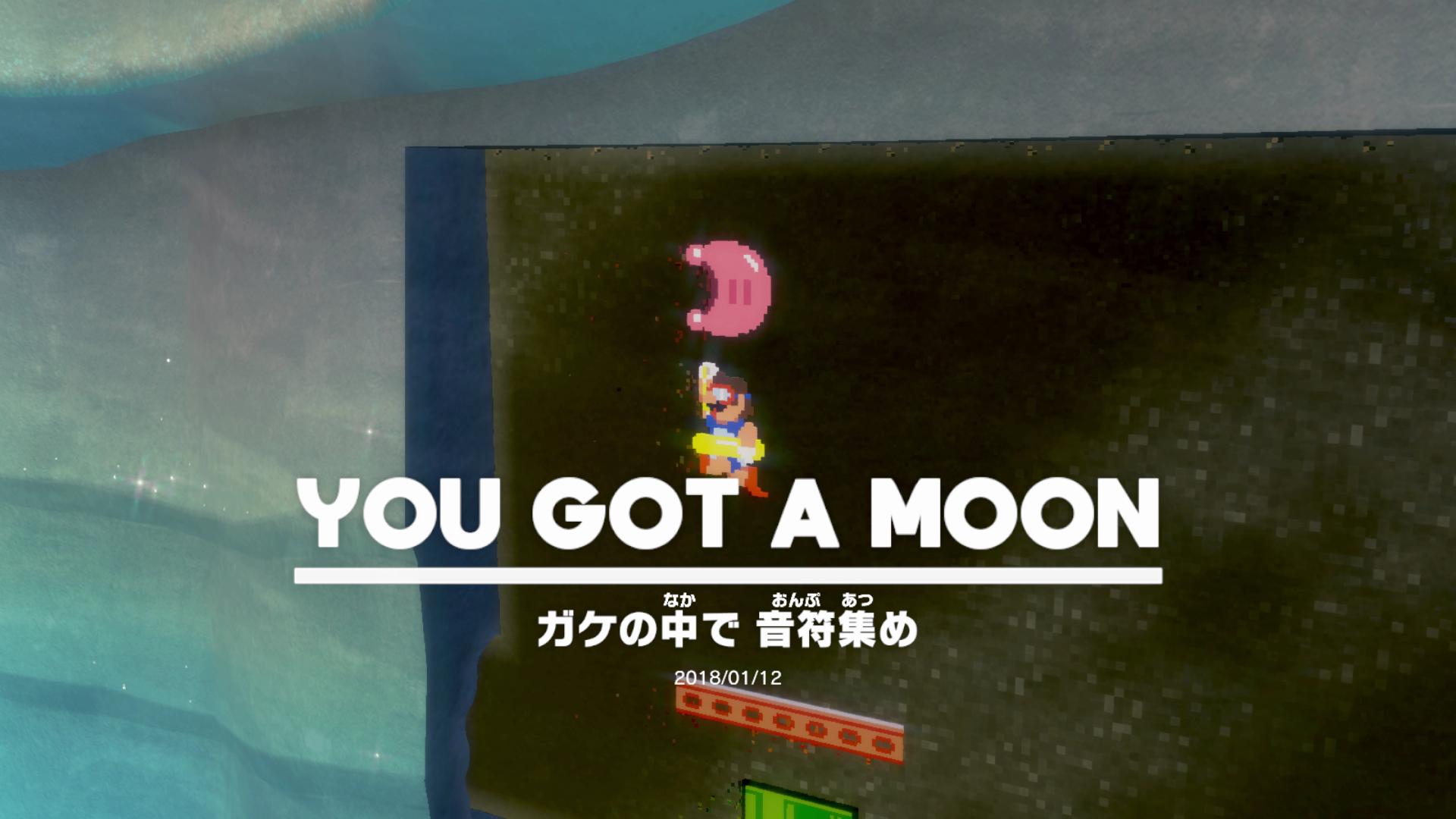
Here we see English, katakana, hiragana, kanji, Arabic numerals, and even the kanji pronunciation guides
As we can see, things have changed a lot since the dawn of Japanese gaming.
Summary
Again, if you’re already familiar with Japanese, most of this was probably old news to you. Even so, my hope is that this brief overview will not only help readers understand why Japanese words can be written in multiple ways, but also how Japanese games and game text have transformed over time.
Whenever a new gaming system comes out, we all ooh and ahh at the improved graphics and sound. I never imagined that text could improve over time too. It’s a fascinating topic that I’m glad I was able look at here. I hope it’s been fun and enlightening for you too!
If you enjoyed this article, you'll like my in-depth article about the notorious L and R problem in Japanese, along with a bunch of other troublesome letters!


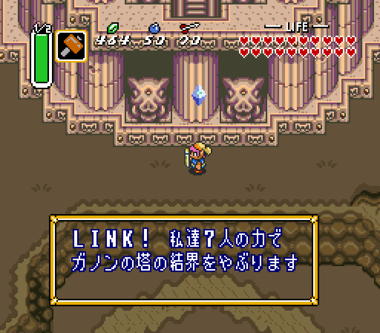
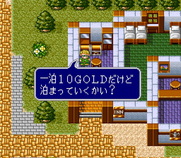
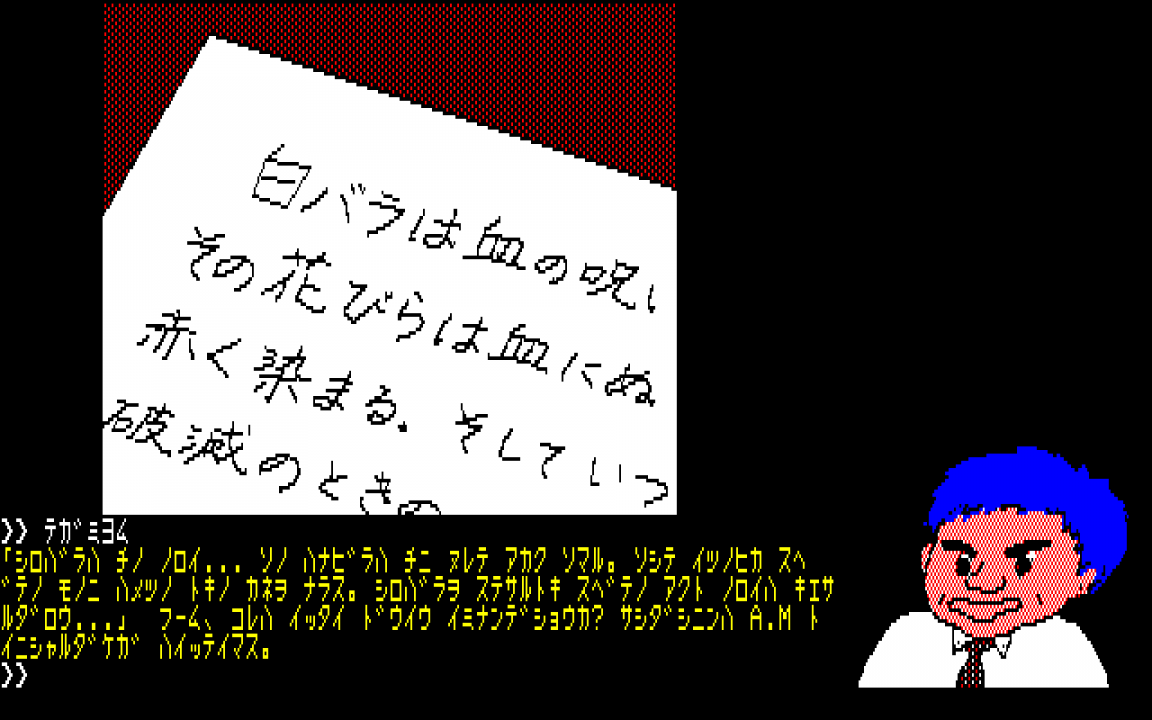
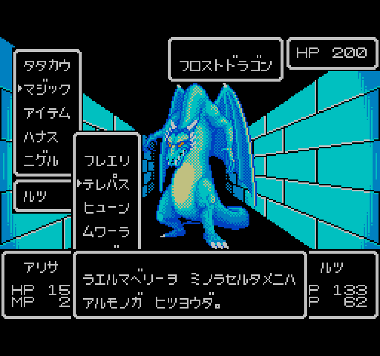
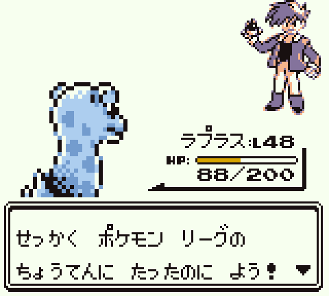
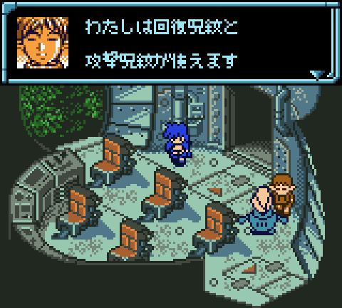
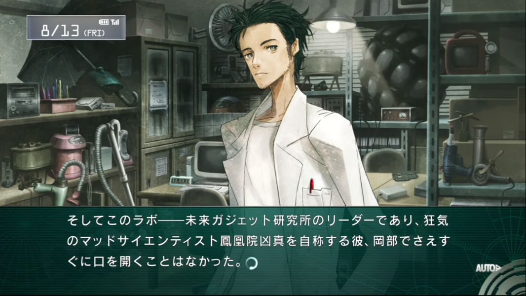
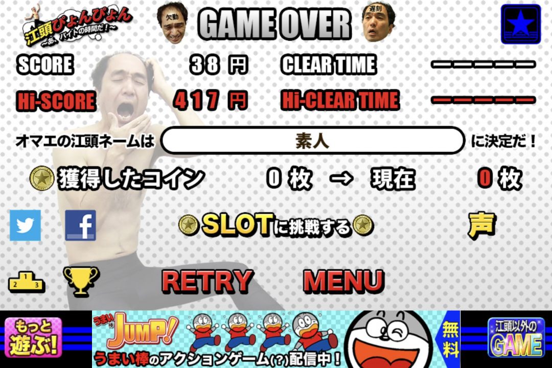
And with portable systems, developers were free to squish the kanji to an impractically tiny size and bring back that lack of readability once again. Thankfully modern resolutions have stopped that nonsense.
Perhaps it’s worth noting it’s not just the programming limits, but difficulty of actually making a font to display the various kanji? This too has largely vanished as games use fonts on the system more and more, but it’s pretty noticeable when English games with distinctive font get translated and get a bland looking font. The PSP is the first I know for absolute certain uses system fonts, but the PlayStation, Saturn, Dreamcast and/or PlayStation 2 might have before it.
Got any example of this?
“Perhaps it’s worth noting it’s not just the programming limits, but difficulty of actually making a font to display the various kanji?”
Well… on older hardware, programming limits and fonts(or “character sets” as they were called) are inextricably bound together. The limitations of the hardware posed a huge influence on the design of the characters, as well as the number of characters included.
But yeah. When your hardware renders characters using 8×8 pixel blocks, a lot of the complex kanji shapes simply cannot be presented. I also suspect that’s why older games are biased towards katakana over hiragana, the sharper and simpler shapes of katakana were easier to make legibly.
(Tangentally, some western characters can pose obstacles too. More than one old computer where H and N look pretty similar, or i and j. )
System fonts were almost universally present on home computers, like the PC-6001 and PC-8801 mentioned in the article. You can often tell what computer a text-heavy game is running on by the shape of the characters because that character set sees heavy usage. And if you look closely, you can see that the PC-8801 games in those screenshots all use the same character set. (I’m reasonably sure that Gundam game is using english for aesthetic purposes, since there’s both katakana and english character sets in the system ROM.)
In game consoles, the Atari 5200, Intellivision, and Colecovision all had a character set in the boot ROM that was accessible to games, and frequently used by them since it was a significant space savings at the time. It isn’t very common on post-crash systems, likely because the reduced cost of ROM meant a game including text characters wasn’t a big problem and the games are carrying a significant load of graphics data anyways.
For the record, 46 characters at 8×8 pixels is 368 bytes before space, punctuation, and numbers are added. English is even cheaper, since you need 26 characters(208 bytes) for an all-caps alphabet. This is likely the primary reason for heavy english in old japanese games, though it subsequently became an aesthetic choice. When your entire game is only 1024 bytes, saving 160 bytes matters. But when your ROM is 128 kilobytes… suddenly it doesn’t seem that important.
That preference for a combination of katakana and Roman characters actually predates video games as we know them. The earliest standard for text on Japanese computer terminals was JIS X 201, written in 1969, which basically took the ASCII standard and extended it to include a full set of half-width katakana characters: https://en.wikipedia.org/wiki/JIS_X_0201
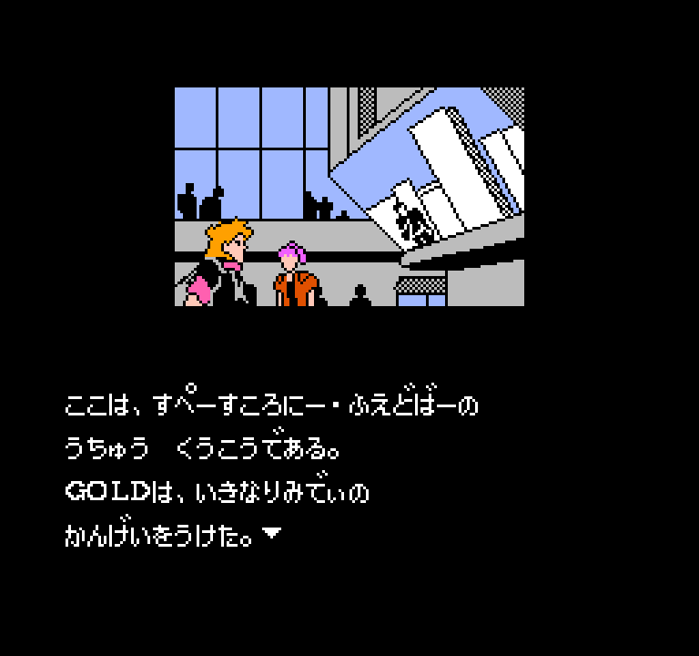
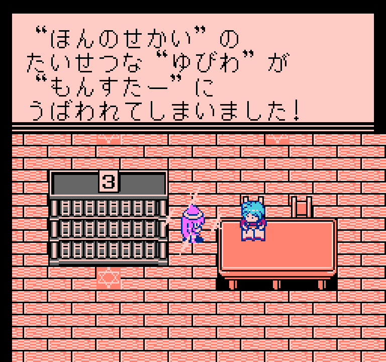
Another thing I’ve been noticing about Japanese text in games, which happens to be represented pretty well in the screenshots in this article, is the handling of dakuten and handakuten (for those who don’t know: the little dots and circles on the top right of some of the characters that modify their pronunciation). I can imagine how frustrating representing those must have been for Japanese font designers. The obvious solution is to overlay them on top of the base character, or draw them with an offset, but the graphics hardware of old consoles tended to use a tiled structure that limited you to drawing one shape per 8×8 grid cell. So the options you had were:
* Include separate characters in your font. But—if I’m counting right—here are 46 basic kana. You can put dakuten on 20 of them, plus handakuten on the ha column, so you’d need to add another 25 symbols. And then double that if you need both hiragana and katakana. And you need to squish them into an 8×8 grid cell and still make them readable. Not a good option. I’d be curious of any game actually tried to do this.
* Write them to the right of the base character. This is the representation that the JIS X 201 standard provided. Because you’re filling an entire grid cell with just a couple of dots, it makes your spacing look awkward. Not a good option.
* Write them above the base character. This means you have to reserve every other line of text for nothing but dots and spaces. Not a good option.
The side-by-side Goonies and Phantasy Star screenshots above are a great example. Phantasy Star puts them above the base characters; Goonies puts them to the right.
Fun fact: the code used to display the diacritics is often reused in ROM translations to display two English/Latin characters with one byte of code. The practice is known as “dual tile encoding” or DTE.
One more option that works well: write vertically and put the voice marks to the right. You still have to leave space between lines, but you’d probably want to do that anyway. It was rarely done, perhaps because it makes localization more work. The only example I can think of is Jarinko Chie: Bakudan Musume no Shiawase Sagashi.
Vertical writing would be prettier, but it doesn’t really help the basic problem of data storage.
To expand a bit more on what I mean… imagine you have a long line of important Japanese text you want to display in kana:
おはよう。わたしのなまえはたなかです。わたしのかもはとてもかわいいですね。
Assuming an ideal case of one byte per character and not adding additional space for readability, you’re looking at 37 bytes to store that line. If you decide that you need to put the dakuten on a separate line to save space in your font or keep the characters readable, though, it’s going to look something like this (with dots in place of whitespace):
・・・・・・・・・・・・・・・・〃・・・・・・・・・・・・・・・・〃
おはよう。わたしのなまえはたなかてす。わたしのかもはとてもかわいいてすね。
That is, you’re using 32 bytes of whitespace to get those two dakuten aligned with the proper base kana.
Now, a smarter space-conscious text parser is going to encode all those extra bytes RLE or something, but that still adds some complexity to your text implementation.
There’s no need to store the text like that, or use RLE, or anything like that. You can simply have the code that prints text treat, say, bytes 80-9f as tiles 00-1f with dakuten, and so on.
So, when it hits a byte like 85, it prints the tile 05 (let’s say は) and sets the tile above it to dakuten. In other words, 85 represents ば. No space wasted, no compression necessary. You can store the text just as you would if your font had all the characters in it.
It might add a little complexity to the code that prints text, but keep in mind it’s probably handling control codes too anyway, for things like newlines or text color or talking animations.
That is absolutely valid, and is probably the least bad approach if you’re concerned primarily about storage space. The trade-off of course is that you have some number of values in your font mapping (up to 50, if you’re using both hiragana and katakana) that aren’t usable for distinct glyphs in the font image. Not necessarily a bad thing, because it means your font image can be smaller too, but limits the amount of fancier things you can do with your font, like adding kanji. And, of course, you still need to reserve every other line in your display for diacritics, but that can be reasonably aesthetic anyway.
For reference, the original font in the specific game I’m thinking of looks like this: http://nleseul.this-life.us/Font%20J.png (Note the dakuten and handakuten towards the bottom center, above and below the ソ glyph.) Here, they packed a 256×256 image completely full of glyphs, so they could include a full set of hiragana and katakana plus a handful of relevant kanji. They’d have had to give up quite a few of those glyphs if they wanted to use single-byte control codes for the diacritics.
Granted, it doesn’t look like the developers of this particular game thought too hard about optimizing their text storage in the first place. I’ve been able to fit quite a bit of extra English text in by using those blank diacritic lines and improving their encoding elsewhere.
Right, there are alternative approaches too, like giving dakuten and handakuten their own codes (as if you were encoding them as separate characters) and having the code print them above the previous character instead of to the side. That does mean ば takes up twice as much space as は (since it has to be encoded as は then ゛), but it’s still more space-economic than actually storing blank lines with dakuten/handakuten in them, compressed or not.
I guess I should also add that, because none of these techniques *necessarily* require changing the way you encode text, my preferred technique by far, when talking about 8×8 text, is in fact drawing dakuten/handakuten above the characters.
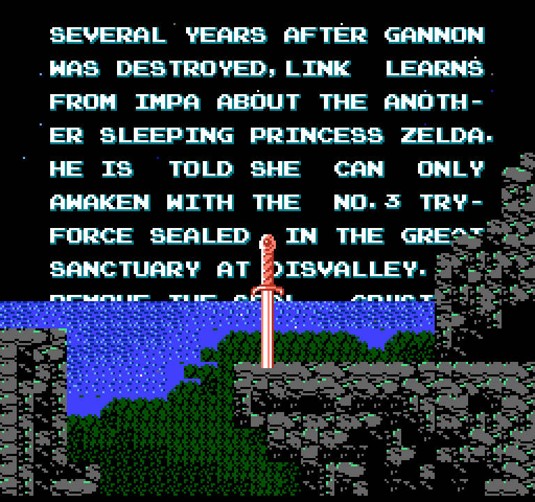
It may seem wasteful to reserve blank lines between each line of text just for that… but I want you to look at that Goonies example again. You’ll notice that, even though it puts dakuten/handakuten to the side, that game still uses double-spaced text. In fact, if you look at the Transformers and Zelda 2 examples above, even those are double-spaced, even though they aren’t even Japanese text!
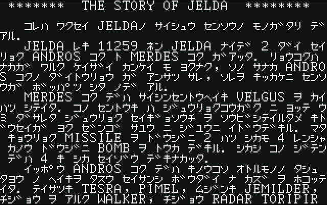
Why? Well, because it’s just plain easier to read! You can see this with the JELDA example, where the text just seems a bit cramped. So, if you’re going to double-space your text anyway (and many games with 8×8 text do), you might as well put that space to good use.
Shin Onigashima uses vertical text, at least.
Vertical text is harder to print on old hardware. Operation of the graphics chip was closely married to the scan of the display, which was left-to-right. This cascades down into the layout of characters in RAM.
To print a line horizontally, you just fill consecutive bytes with your characters. To print two lines, you just… keep going farther. To print a line vertically, you have to count bytes out and drop one every 32 bytes or whatever the screen width is, and adjust your index when you move to a different line. It is more error-prone and takes more clock cycles.
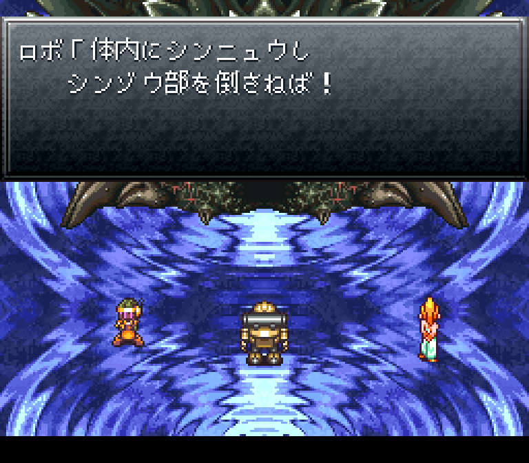
Chrono Trigger used a cool trick to fit Magus’s name–Maou, or 魔王–into the battle dialog boxes and still keep it legible: by using the standard written shorthand for the first, more complex character that replaced all that gunk under the “roof” with a katakana “ma”. You can see both versions of the character in this screenshot: the full version in the dialogue at the top of the screen and the shorthand in the enemy-names box to the lower left. I think it was the first time I’d seen an abbreviated kanji, and I loved everything about it.
I didn’t know what that was until Mato told me about it after I came across a similar situation in a DS game Remindelight which I think used an 8×16 font with kanji. That same “ma” character. I suspected it was spelling out mahou, with the hou kanji normal.
Maten Douji (AKA Conquest of the Crystal Palace) uses the exact same abbreviation on the walls of the final stage. I actually tried looking it up and was confused when I couldn’t find it in a dictionary… until I realized that マ is pronounced “ma” and is commonly used to represent 魔 when paired with the radical 广.
https://i.imgtc.com/nxzjP5k.png
Come to think of it, abbreviations in Japanese would be a great subject for Legends of Localization to tackle!
Yeah, that definitely would be an interesting article for sure! And while they’re at it, tackle the usage of the so-called Kyujitai and Shinjitai forms.
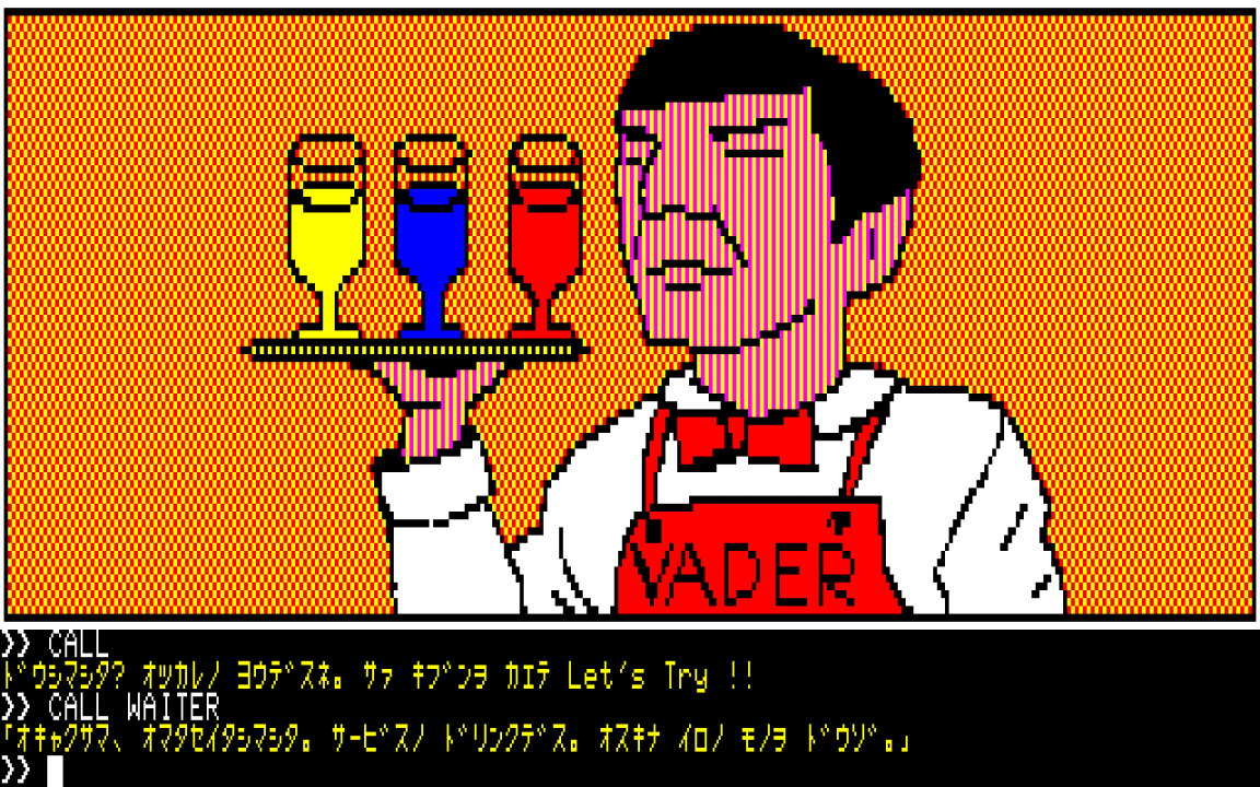
Is the waiter in Juggler Stone supposed to be Spock?
It’s funny that at the same time Japan finally gets Kanji in the late 16-bit era, we finally get proportional fonts. Chrono Trigger was such a pleasure to read when it came out.
Of course not! That’s clearly VADER
That is Darth Vader from the planet Vulcan.
Interestingly, proportional fonts were a more difficult task than kanji.
Kanji was a natural function of increases in resolution and ROM size, but proportional fonts required a mildly complex software routine to draw new tiles on-the-fly because the display hardware uses fixed-width characters. Proportional fonts were made possible mostly by faster processors.
And then there’s Korean, which until there was enough space to render all combinations, was an absolute nightmare to render.
Isn’t using hiragana for everything mostly considered childish though? In Tales of Graces, when Asbel and Hubert were kids, their artes were written entirely in hiragana to reflect the fact they were kids and likely wrote that way. Fast forward when they’re older and their artes are entirely in kanji (except for Hubert’s gun artes, which all use katakana).
Hiragana-only can sometimes feel kind of childish when it’s used when katakana or kanji would normally be expected, but
it’s already expected that games and computers and stuff will have font limitations. So a game written entirely in hiragana probably isn’t as big of a deal as a college textbook written entirely in hiragana.
Meant to write “mostly considered childish nowadays”, my mistake. I mean, after a certain point, games started using kanji more often so as to both save space and because by that point Japanese gamers were grown up enough to know how to read them.
Just to add another case of usages, I just so happened to ask someone fluent in Japanese how weapons are written in Fire Emblem Heroes.
Apparently, katakana is used for anything with a proper name that isn’t Japanese. For instance, the sword Durandal would be written in katakana, which makes sense, it is a foreign object to Japan. On the other hand, the sword Rajinto, being naturally Japanese, is written in kanji.
Also written in kanji are generic weapons whose names are comprised of common words, like an Iron Sword or Brave Lance. And so is the “‘s Weapon” part of things like “Titania’s Axe”. The character names themselves appear to be in katakana, even for the Hoshidans (fictional Japanese) of Fates.
Would this be the case in other non-FE games?
Yeah, the different writing systems can potentially be used to give words a certain “feeling” if a creator wanted to. I’m reminded of Mother 1 for the Famicom, in which there’s a katana weapon, but it’s spelled out as “KATANA” in English. I forget why exactly, but the game creator could’ve easily written it in hiragana or katakana.
Well, the setting’s supposed to be America in 1980s so that might tell you something…
Japanese uses kanji for the same reason that English has such non-intuitive spellings: people have used it for centuries, and it’s hard to give up such old traditions.
Much like with English orthography, some people will argue that kanji is absolutely necessary for distinguishing between homophones – even though people have no difficulty talking to one another – but this is just an after-the-fact justification.
While I’ve always liked the “Compare Hiragana and Katakana the way you would plain text and italics,” I’ve never really bought the “English has capitals and lower case letters” argument. It might help a student get over the hurdle of “Oh, our language has two character sets too” when italics isn’t obviously a distinct character set to an English reader, but caps are used to a serious minimum in English text, and many of the characters between the two sets are highly similar, whereas Hiragana and Katakana are mostly distinct.
Moreover… lower case and caps aren’t actually that beneficial to readability! English has both character sets for historic reasons that don’t necessarily stand today, and any slowdown in reading them is just a matter of lack of practice. The SMUSHEDCAPITALTEXT example in the article isn’t hard to read because it’s in caps – any dried-up old Homestuck fan can tell you that. It’s hard to read because it doesn’t have any spaces… and that makes it a poor example for the “Japanese’ multiple character sets improve readability” argument, because Japanese doesn’t have any spaces!
Virtually everything else about what makes English hard to read is true, though. English is is a disaster language among disaster languages. I just have a pet peeve about the caps/lower case argument.
Whoops, replied to this by accident. Though for what it’s worth, I suppose capital letters are like kanji – here for mostly historic reasons!
What about cursive? I think that’s at least somewhat illegible to someone without training. The difference in glyphs seems approximate, i.e. both languages have curvy/swirly type and angular/blocky type.
Ooo, I like that! Cursive definitely works as an “English has two [or more!] character sets argument.” …Though it’s dying out so fast I don’t know how much longer it’ll last as a comparison!
Well, to muddle the issue further, kanji can also be written in a barely-legible calligraphic form…
It’s not THAT illegible. If you study Japanese, your teacher will hammer hard how important it is to learn the correct stroke order for writing kanji. With practice that skill translates into being able to read the calligraphic form — your eyes follow the brush strokes and that triggers the same skill memory as writing the character down.
Of course, the comment about cursive dying out applies here, too. The epithet “wapuro-baka” (“word processor idiot”) is used to describe people who can’t write kanji correctly because they always have a computer to pick out the right character for them.
As someone who’s studied Chinese for about 8 years now, I still cannot read some people’s handwriting, and the writing system is all kanji. Knowing stroke order doesn’t help for me at least, the characters become too foreign looking to what I’m used to. Even my Chinese wife has trouble reading her mom’s handwriting sometimes because it’s so out there. So I think it depends. There are definitely some calligraphic forms that I do not fault people for not being able to identify the character from.
Just to note though, it might be easier in Japanese if the calligraphy that people write with is more standardized (I usually don’t have trouble identifying a calligraphic character in a Japanese game or movie unless it uses a Japanese variant), so I could be extrapolating too much.
I distinctly disagree with the notion that this is an after-the-fact justification. There’s more to it than that. Speech has a lot of additional information that isn’t present in text. Syllable stress, for example, isn’t written down, and only certain kinds of pauses show up in text. In an orthography where you can’t use spaces to separate words, identifying where one word ends and another word begins at a quick glance is a lot harder than identifying those boundaries in speech.
It may be true that it’s not ABSOLUTELY necessary to distinguish homophones. And the specifics of the orthography are certainly due to tradition. But saying that’s the ONLY reason it has it is shortsighted — if the written language didn’t evolve in that direction, it would have evolved in another direction to provide similar benefits. After all, it’s important to be able to read a body of text quickly and accurately.
I forgot the most important part: In speech, if a homophone confuses you, you can just… y’know… ask.
Many Japanese words are not homophones even if they’d be written with the same kana. They have different pitch accents (what English speakers call syllable stress.)
For instance “hashi”, “hashi” and “hashi” are just like “read” and “read”.
Hiragana and katakana kinda remind me of Korea’s hangul alphabet. Like hiragana and katakana, hangul is entirely syllabic-based. However, unlike Japan, Korea completely abandoned Chinese pictographs centuries ago in favor of hangul alone as a means of boosting literacy rates. The effort did succeed in the end, but what I am curious about is how Japan’s writing system might’ve been different had they done something similar and decided to stick with only hiragana or only katakana. Given that Japanese has a lot of homophones, and as you mentioned, little separation between words in written form, how do you think a one-alphabet writing system would be altered to accommodate this?
Hangul uses spaces between words, so there’s that.
Korean also has a lot fewer homophones, which helps
There have been a number of efforts over the last couple centuries to abolish kanji from the language, but it seems they’ve pretty much been abandoned now. Despite their vast number and difficulty, a lot of people like kanji, or at least consider them important as part of the culture. The current system is largely the result of one such effort around the time of WWII, which led to changes to avoid rarely-used and redundant characters, a standard list of kanji to be used preferentially and taught in school, and guidelines describing what should be written in which system.
I imagine abandoning kanji would mean, at the very least, incorporating spaces between words. That’s what NES games and such do. As far as I know, there were never plans to do anything more if such reforms were adopted, but maybe something would evolve over time. Kanji themselves are sort of the reason there are so many homophones in the first place; sounds that were distinct in Chinese blended together when adapted to Japanese phonology. I wonder if losing kanji would encourage pronunciations to drift apart. That would be a very slow process, of course, but it would eventually solve that problem.
There are two ways to pronounce “number”? Aside from regional differences in how the letter r is pronounced and specific non-semantic differences in vowel pronunciation, what variation is there?
Maybe rolling the ‘u’ sound into an ‘a’, like naaahmber? This seems most prevalent in ESL, though, at least in my experience.
That falls under “non-semantic differences in vowel pronunciation”. That particular “u” is a back unrounded vowel (IPA ʌ) and there’s a fairly broad range of related sounds that fall into that category that English speakers don’t distinguish between. Imagine the words “duck” and “dock” and think about how close you can get to saying “dock” while still being understood as saying “duck”, then go the other way towards “deck” for the same effect. Subtle distinctions in vowels like this are part of what give regional accents their characteristic sounds, but you wouldn’t likely NOTICE that it’s different unless it went as far as saying “noomber” or “nohmber”. And you’d still UNDERSTAND that, but it would clearly sound nonstandard to most Americans and most British people; people will interpret that as being intended as the same pronunciation.
So a claim like “there are two ways to pronounce ‘number'” sounds like it’s meant to imply that there are two ways that a single person might pronounce it, such as the difference between “REcord” (noun, a log of events) and “reCORD” (verb, to copy a performance).
I’d say a better example would be the difference between /rut/ and /rɑʊt/.
No, I think that gets a bit distracted from the issue. That’s not a matter of pronouncing the same vowel in slightly different ways. Those are distinctly different vowels, and it’s just straight up a matter of different dialects pronouncing the word in two different ways.
Yeah, as in “my hands got number the longer I kept them in the freezer”
I’m not familiar with this usage as “more numb” seems to be the standard. Looking at various dictionaries, I don’t see this usage there.
Ahh, I didn’t even think of that. Silent B! Of course, silent letters are already a mess in this discussion.
“number” as you’re using it is not a word in English, it’s “more numb”. “number only has one correct pronunciation unless you have a speech impediment. Similarly, “chrain” instead of “train” is completely non-sensical asnd certainly something I have never heard of. Anyone that says “chrain” has little grasp on how to speak the English language. I’m sorry but that entire statement in the article is false.
Wow, that’s awfully prescriptivistic of you, and painfully ethnocentric. Different parts of the world have people who speak in different accents. Are you really going to say that YOUR accent is the right one and everyone else is wrong in some way or another? Just because you’ve never heard it among the people you talk to doesn’t mean it doesn’t happen, and it doesn’t mean it’s wrong.
Having the “tr” of “train” come out sounding a little like “chr” is common in a lot of American accents. It’s not such a strong “ch” as in “church”, and people with this accent won’t even notice they’re doing it even if the two pronunciations are put side-by-side unless they’re specifically looking for a difference.
As far as “numb + -er” not being a word… I mean, it’s in both the Random House and Cambridge Dictionaries, listed as the comparative form of “numb” in both cases.
“Wow, that’s awfully prescriptivistic of you, and painfully ethnocentric. Different parts of the world have people who speak in different accents.”
No, we can use your dictionaries to see the correct pronunciation. Anything else is wrong, period.
Also you’re lying about numb in the dictionary: https://dictionary.cambridge.org/us/dictionary/english/numb
Dictionaries describe how speakers of a language use words. They are not the be-all, end-all of any language. Just because it’s not in a dictionary, does not mean it is not used that way.
Of couse not, we can see that in daily use. Regardless, if you deviate from the set pronunciation, as can easily be seen in the primary dictionaries of your country, you are technically saying it wrong.
Plus, we have the internet (or other electronic dictionaries) now that you can literally push a button and it will speak out how to properly say words.
Most of the UK would disagree that the Internet’s electronic dictionaries provide an accurate pronunciation of English words.
Um… that link supports what I said, not refutes it:
> numb
> adjective [ -er/-est only ]
That is to say, it’s saying numb, number, numbest is the way you do comparisons with the word.
“Anything else is wrong, period.”
Like I said: That’s awfully prescriptivistic of you, as if the only people allowed to be the arbiters of how a language is used are the academics that write reference guides. If that were true, then why would dictionaries be adding new words every year? The only way that makes sense is if dictionaries are trying to track how language is actually used instead of dictating how the language is meant to be used.
You’re right, that’s what happens posting without sleep. I’ll concede that point. As far as I’m concerned, it’s still not a silent B in the comparative.
“Most of the UK would disagree”
“Most of the UK” are, in a way, ESL. English is England. Despite their many barely intelligible regional dialects as well, there are still reference materials and an education system that attempts to teach the proper received pronunciation to kids.
Received Pronunciation is exactly my point — online reference materials use AMERICAN pronunciation. The exceptionally good ones ALSO provide RP, but it’s almost always a second-class citizen. So if RP is “right” then most reference material is wrong.
English has many dialects. There are standard dialects, but that does not indicate that other people’s way of speaking is incorrect. Number as an adjective for “more numb” is acceptable to many speakers, makes logical sense with English grammar, and does not impede the understandability of the speaker.
Num-ber vs. Num-bah? Didn’t you watch KND?
Unlike most DS kids’ games, the Japanese version of The Legend of Zelda: Spirit Tracks uses kanji, but you have to touch the characters to see the furigana instead of them being visible by default. They use this to hide a reference to Tetra. Since Spirit Tracks has a relatively large font, is this because of the resolution?
I’m not sure as I haven’t played it myself, but that does sound like a good reason for the touch system. I didn’t know about that, that’s really neat.
Legend of Zelda games beginning with the Wind Waker I believe have always used furigana. Earlier games such as Ocarina of Time for N64 doesn’t use them as the technology was likely too primitive for that. And as mentioned in your posts, it’s likely both Spirit Tracks and Phantom Hourglass also had technical limitations standing in the way of properly utilizing it.
From what I know, Phantom Hourglass doesn’t use kanji.
Nice article. After reading this, it hit me that Faxanadu from 1987 and Hitler no Fukkatsu (Bionic Commando) from 1988 appears to be very early console examples that including all three Japanese writing systems.
Yeah, it’s neat seeing how some developers around that time managed to wrangle all three systems in when so many other devs still relied on one.
This reminds me of Ninja Gaiden and how it managed to incorporate Kanji in cutscenes despite the limitations at the time. Either Tecmo incorporated additional chips in the cartridge to facilitate their display or the dialogue text are actually images. Either way, it’s quite impressive.
Well, as far as the NES and SNES graphics hardware is concerned, there’s no particular difference between text and images; it’s all just data that gets copied from a bitmap in memory somewhere into video memory. You can fill your font bitmap with whatever glyphs you want; it’s just the more glyphs you have in the font, the less space you have in video memory for other graphics. I haven’t looked specifically at Ninja Gaiden in a debugger, but I’m guessing they had a large font image with 256 glyphs in it loaded during the cut scenes (similar to the SNES one I linked elsewhere in this post), and a smaller one containing only Roman characters and numerals during gameplay.
I will say that I played the Nintendo Switch Online release of Japanese Ninja Gaiden (actually called 忍者龍剣伝; ninja ryukenden) a little bit, and I literally spent a couple hours scribbling in a kanji dictionary trying to identify the mess of pixels they used for the 邪 in 邪神. 8×8 kanji are not always the best idea.
Makes sense I suppose. Again, it was quite impressive when you take the era into account. And yep, I guess you could say it’s fascinating how many Japanese games would use random English here and there, especially in JRPG titles. By contrast, western titles will use Japanese text everywhere they can, even in menus. While correct, you could say this creates a somewhat jarring effect. Compare the title screens of Metal Gear Solid and Call of Duty for example. Or Final Fantasy and Elder Scrolls.
No, there’s… not really anything impressive about it. All they did was add an extra 20 characters or so to the font. It’s no different than Final Fantasy having all these “sword/shield/knife/etc” icons in its font for use in weapon names.
Right, of course. Even so, do you have examples to share about stuff developers managed to do despite the limitations?
I do indeed, actually. As I said, adding a couple kanji to a font isn’t super impressive in itself, but adding a whole ton of them usually wasn’t possible – so what they had to do was to write the entire game script in a way that let them use the same few kanji over and over and over throughout the game, while still having it read natural.
Ever noticed how often the word “thief/”thieves” appears in A Link to the Past, for instance? That’s because the word 盗賊 appeared over and over in the Japanese version – and it did that because they had decided those two kanji were going to be among the 40 or so to be included in the font and wrote the script with that in mind.
It’s pretty impressive that the scripts turned out as well as they did despite these limitations.
I imagine it must have been tough indeed writing the script and making sure it stayed within the limits in regards to the Kanji. Might as well be an interesting topic to tackle someday.
Dialogue-heavy NES games may utilize a dictionary with text being a list of memory pointers corresponding to list locations. So, instead of dialogue being stored as strings of text, the game’s “font” is used to store memory addresses referencing strings which expand into words when processed. It can even be recursive, meaning that another call to the dictionary can be made while still processing a word within the dictionary. This can be useful for compound words and words that are substrings of others.
Chrono Trigger also utilizes a dictionary. I believe also Dragon Warrior utilizes this approach, which is how so much text fits into an 80K ROM. Seiken Densetsu 3 already used advanced text compression techniques even for Japanese and thus there was no hope for localization without expanding the ROM.
Fascinating stuff indeed.
FYI, Ninja Gaiden is an MMC1 title, as bog standard as it gets.
Do you ever still think about translating StarTropics into Japanese?
It’s a bad idea to translate into a language you’re not a native of.
Yeah, I still think about it from time to time, but realistically I don’t think I’ll ever set aside the time for it.
…But when I think about how the process + localization issues could make for some really fun articles, I don’t wanna give it up.
Well I mean cursive isn’t really needed…
It’s not anymore, but that’s only because of the invention of the ballpoint pen. Cursive was almost a requirement to write with pens that didn’t stop flowing between letters. Everything else you have to apply force against the paper in order to leave a mark, so it’s easier to NOT use cursive. People who have never used a quill pen or fountain pen don’t realize how different of an experience it is compared to writing with a pencil, marker, or ballpoint pen.
Huh, I never knew that’s why cursive existed. That’s pretty neat!
Exactly! I was just explaining this to someone the other day.
I don’t know. Even with a ball point if have write, like, a five page letter, my hand will hurt so badly if I try to do all in print. With script-letters it is painless.
Another thing that may be interesting: Many of the script-capitals don’t come up very often, so many adults have forgotten some of them. I know my father inserts print-capitals into his script writing pretty often.
It’s not a frequent issue, but cursive’s inflexibility in stroke order can be helpful for simple handwriting recognition systems. I had an iPaq back when that was a thing one might have, and it couldn’t read a thing I wrote unless it was in cursive. I generally write vertical strokes bottom to top, and it couldn’t handle that. I still have trouble with Professor/Kat Layton games when they want you to write out answers.
It’s funny to me that you used StarTropics as an example since those games were not released in Japan, and the dialogue has a rather western slant to them.
Also, the waiter (vader?) in Juggler Stone looks like Mr. Spock
“ITDSUCKIFYOUHADTOREADTHREEHUNDREDPAGEBOOKSWRITTENLIKETHISINENGLISHANDIFWEALLHADTOWRITEEVERYTHINGINENGLISHTHISWAY”
Hahahahahaha!
Mato! Really funny example!
IWILLNEVERLETYOUFORGETABOUTMEBRINGMEBACKHERE
A sorta memorable example from FF8. Apparently, this is the message Sorceress Adel projects from space and up until the events of the game, has been the source of static plaguing the world rendering most forms of TV useless.
Really appreciate this article.
My fiancee, who is orginally from Japan, and I often have discussions about Japanese language.
And one of the things that I found rather interesting is when she sees an kanji she doesn’t know and has not context to even figure out what it should sound like if there are no pronounciation hiragana above it
I had not really thought about before and can imagine the difficulty even native born Japanese readers would have with their own kanji system. How do you get context clues or pronounciation reference with a non-alphabetic writing system? I think you can’t!
It makes me appreciate the simpler alphabetic nature of western-Romanized written languages, because even though we may see a word that we don’t know the meaning to, we still have the ability to pronouce it and look it up in a dictionary.
My fiancee has often mentioned her frustration at unfamiliar kanji because she doesn’t even have a reference to look it up with!
Language is endlessly fascinating.
It’s not as bad as you think. All kanji are made up of smaller chunks called “radicals”, and these radicals will hint towards both pronunciation and meaning. They can also be used to look up the kanji.
Thanks! I will pass that along to her!
Not gonna lie, discovering online Japanese dictionaries such as https://tangorin.com/ that allow for some sort of “reverse lookup” using radicals has really helped me out when it comes to finding kanji that I’m not familiar with.
In addition to radicals (such as 氵 or 亻 which come from 水 water and 人 person, most characters with those radicals will have something to do with them), we have the luxury of handwriting input and OCR technology these days. Handwriting input lets you draw a character into a box on your phone or computer’s screen and the computer guesses what character you were trying to write. They can be a little sensitive to stroke order though.
OCR is built into some apps and allows you to use the camera on your phone to scan and identify the characters. It can be very helpful when it functions as intended. Other than that, I would suggest looking into dictionary apps. There’s plenty of free ones, and if she can think of a Japanese dictionary she trusts, they probably have an app. I don’t really know dictionary apps too well, and my friend tells me the one I is pretty low-grade, so maybe just search for that kind of stuff if no one else has suggestions.
Good luck!
If you ask me, this clearly is a fascinating topic indeed. As someone who might from time to time watch japanese gameplay videos on YT, it’s become somewhat simple to spot certain patterns in regards to the scripts. Most obviously, many Japanese games such as JRPGs are kinda expected to have english here and there such as menus. On the other hand, western developed games will have them translated in full, menus included. On the other hand, Japanese games fully being in Japanese aren’t unheard of either but in this case, it’s usually games intended for young children or games highlighting their Japanese-ness to the audience so to speak. A good clue might be whether the title is spelled entirely in Kanji and Kana but even that isn’t a hard and fast rule. In any case, play a game in Japanese yourself and see how much English you will encounter in places.
Very great and interesting article !
However, I must add that this article is wrong in calling the Latin alphabet (A-Z letters) either “English letters” or “English alphabet”, and this error is made a dozen of times !
There’s no such thing as “English letters”, and the Latin alphabet predated the existence of written English by several centuries. Calling the Latin alphabet “English letters” is incredibly American/Anglo-Saxon centrist, and almost insulting toward the hundred of other languages also using the Latin alphabet !
It is absolutely not incorrect to refer to the English alphabet. Some other languages that use the same writing system have different alphabets. Spanish for example traditionally has four letters in its alphabet that aren’t in the English alphabet. Spanish, French, and German also use diacritics that aren’t used with the English alphabet. And English has three letters in its alphabet that weren’t in the classical Latin alphabet. By specifying the English alphabet, you explicitly refer to A B C D E F G H I J K L M N O P Q R S T U V W X Y Z, no more, no less, in that specific order.
And it’s not incorrect to refer to the letters used in English as English letters.
You wrote that:
“There are even professional guidelines that prescribe how much hiragana, katakana, and kanji any given sentence should ideally have.”
Would you happen to have any links to stuff like that?